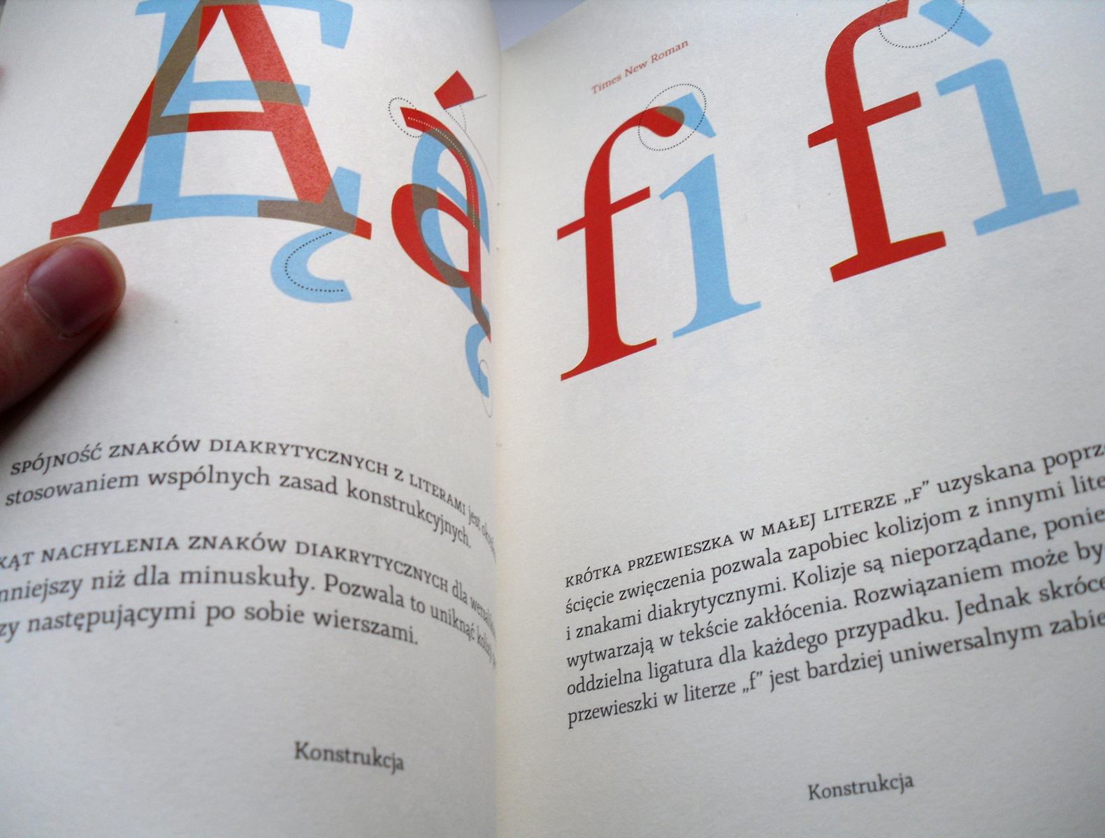


The Young typeface is designed for laying out long texts in small print size. It fulfills most of the demands set before such typefaces. The line of the capitals runs below the lines of the ascenders, leaving more space for diacritics, and preventing the capital letters from sticking out. The vertical (and slightly condensed) oval of the round letters conserves space. Setting the round letters on a diagonal axis, the low contrast, and the proportions of the ascenders and descenders to “x” height draw from the Renaissance tradition. As the designer writes, the type combines “geometry with instrumentality,” which means, in spite of the above-mentioned historical attributes, that it is utterly contemporary. The type has a full set of characters, including ligatures and small caps. One would like to see how italic and bold variants might look. Only then could one fully evaluate the virtues of this type in a layout.